visual communication design
charles horne
Brief
The client
Tired Co. is a recognisable skate brand based in Melbourne, Australia, established in 2009. The company owns a skate park and shop opposite each other, on the outskirts of Melbourne City (Docklands), and specialize in all skate culture, providing skate equipment, news, and boards. Tired Co. strives to adapt to the ever-evolving sport of skateboarding and host local, youth to young adult events and tournaments annually. However, both believe that while skating evolves their brand needs to be rethought and adapted to cater for the growing community of skaters across Melbourne. The owner is eager to update/redo his branding within his shop which will also be applied to new products. Furthermore, the client wishes to introduce a digital presence to promote his shop and park.
Presentation 1
The first requirement of Tired Co. is a new, attention grabbing and maintaining, visual identity that is able to be applied to different presentation formats for their marketing needs. In order to represent the Tired Co. brand, the visual identity needs to be eye catching and uniquely recognisable, while still reflecting ‘skate culture’ to maintain a social acceptance within the current skate community.
Presentation 2
In addition to Tired Co.’s need for rebranding, they wish to expand their influence online and develop a professional, well-designed, webpage in which can inform the public of Melbourne of the park’s history, location, upcoming events, public lessons, and products that are sold in store. This is so that the brand can be easier to access for the targeted audience and sell products.
folio
selected pages


magazine
presentation 1


website
presentation 2


![Website Product [Base Page].png](https://images.squarespace-cdn.com/content/v1/5f4c6452063c1828e5777c8b/1603145445940-4G3FT6PEV3TYVOQ9C2C9/Website+Product+%5BBase+Page%5D.png)
![Website Product [Respective Pages].png](https://images.squarespace-cdn.com/content/v1/5f4c6452063c1828e5777c8b/1603145464780-NCTLXSNTBV0HJWJODZ8T/Website+Product+%5BRespective+Pages%5D.png)
unit 3 practical work
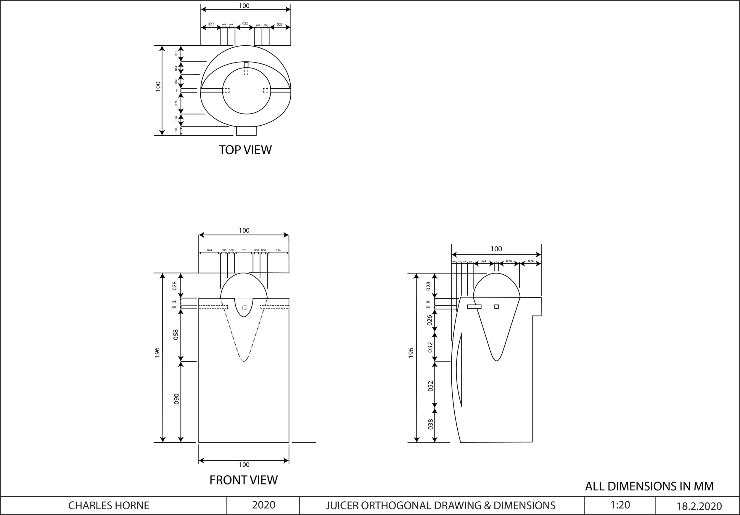
viewing platform: 2d drawing
unit 3 practical work

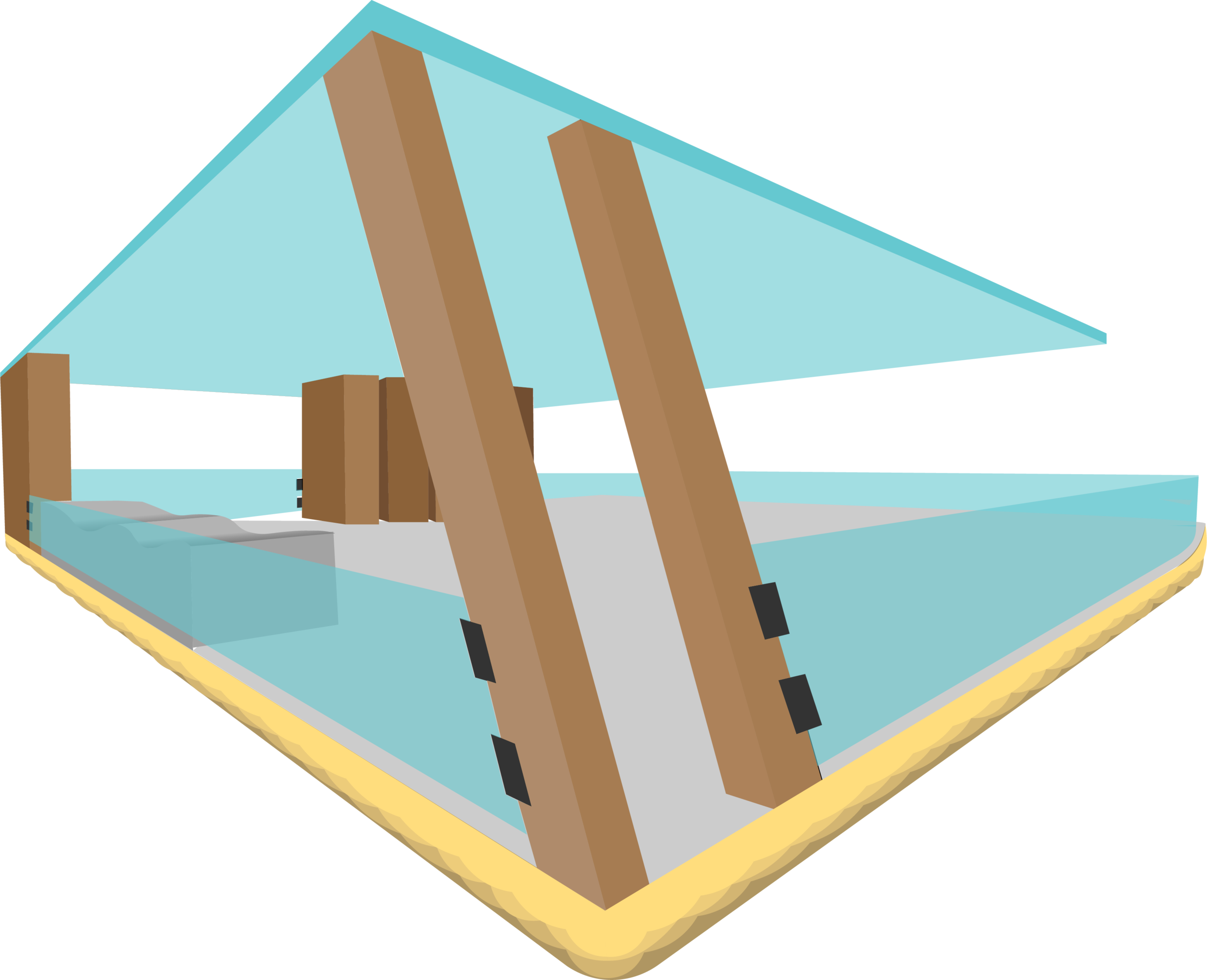
viewing platform: 3d drawing
unit 3 practical work

juicer: presentation board
unit 3 practical work

